Branding // The Lawn Salon
A client was looking to take his landscaping business to the next level but had little money for marketing. We made a strategic plan to hit on essential needs like branding and then bring in other pieces down the road.
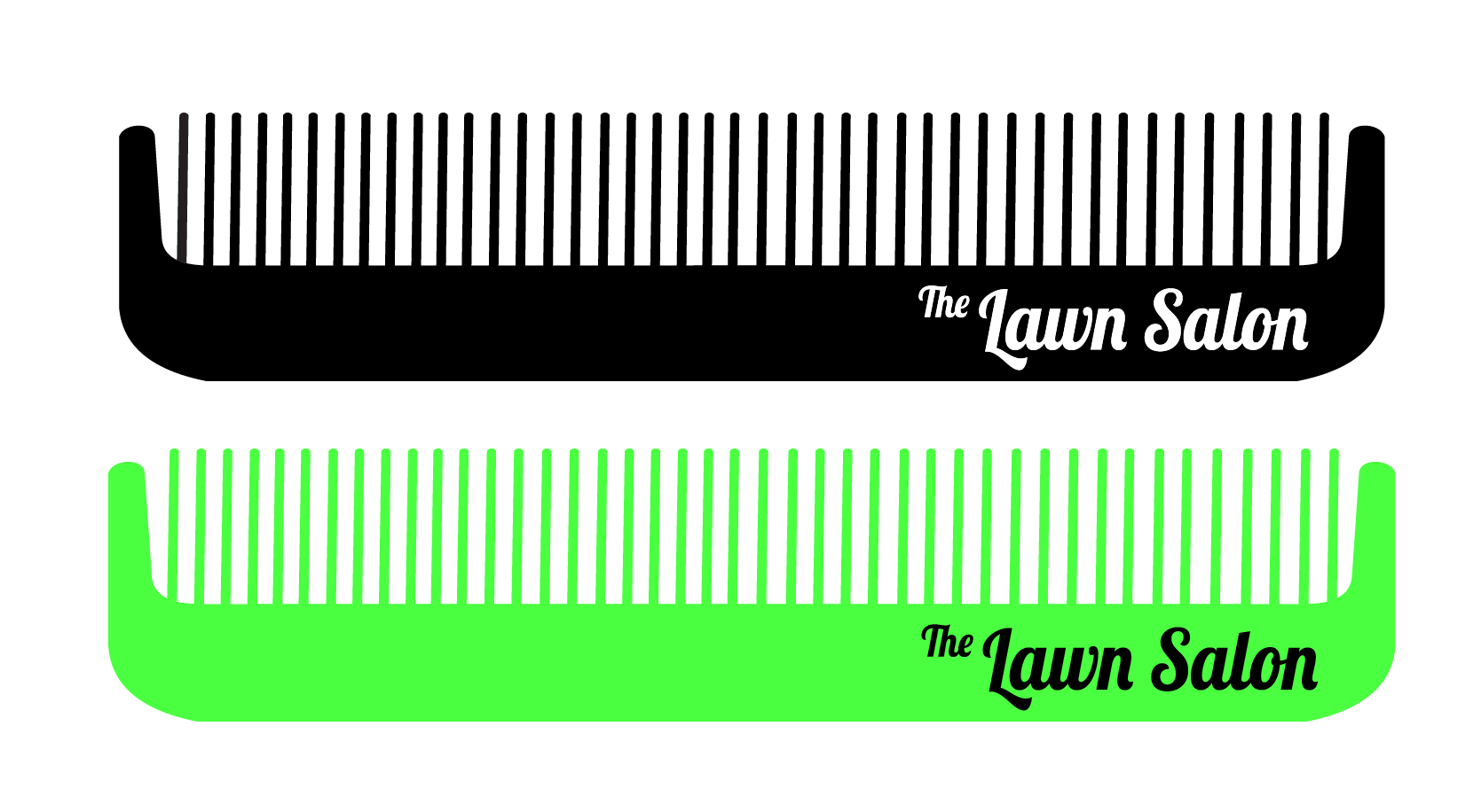
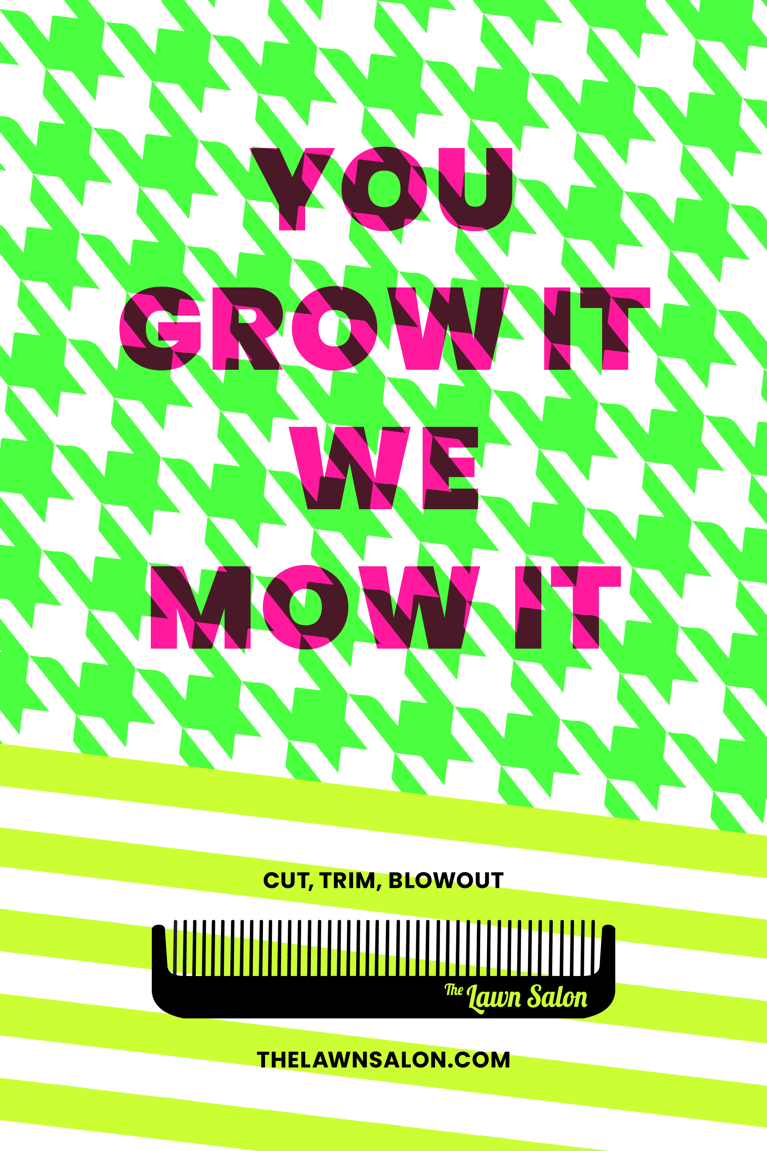
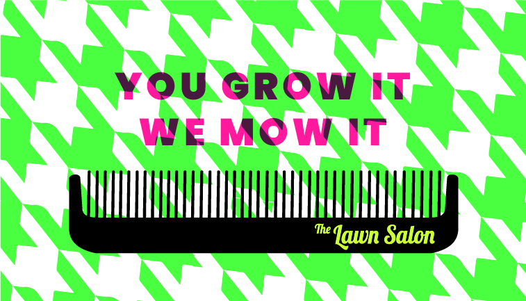
I developed a logo around a simple comb element that really activated a playful and bold vibe. I really celebrated the bright neon colors of the landscaping and brought in the pink for punch. I also played with patterns like stripes and houndstooth to layer in that abstract lawn texture.
Working with the client, we got creative with flyers and used a shredder to dip and fold to mimic uncut grass. It was something memorable for the potential customers, but also very cheap production.